Styling The v2 Subscriber Portal
Changing the Appearance and Styling of the v2 Subscriber Portal
v2 Portal Uses Material Design and Material Web ComponentsMaterial is Google’s open-source design system for build beautiful, usable products. The v2 Portal styling and UI was designed & developed using the Material Design framework and Material Web components. Developers & designers can use their familiarity with Material design concepts to further style & customize the components and elements of the v2 Portal on their own websites.
The v2 Portal's appearance can be completely customized to display seamlessly with the connected site or online store that it appears in. To customize the v2 Portal's display, navigate to the "Customer Portal" page within your connected QPilot Site's Settings page and scroll to the section v2 Portal Settings.
In this example screen recording, a merchant changes the Primary Color in the Display Options and then adds CSS to the Custom Styles (CSS) text input to change the default Primary Color across the entire v2 Portal and then change the layout of the Action Buttons in the Detailed View > Detailed Summary Component to show inline instead of scrolling.
Want the CSS used in this example? See Example CSS Changes (below) and find the example: "Selecting the Action Buttons in the Details View > Detailed Summary Component: change to display inline and add margin to both filled and outlined buttons".
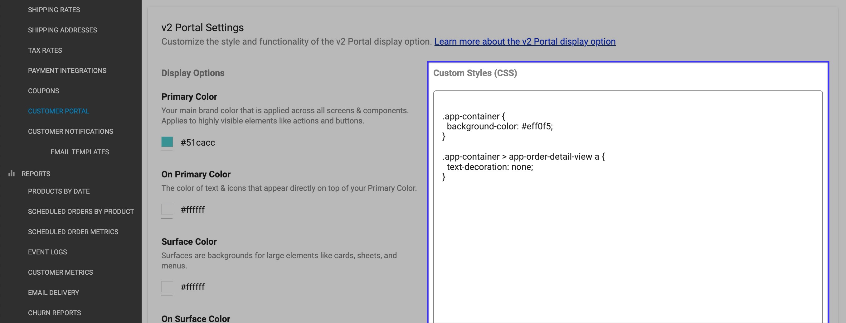
Display Options
Display Options enable you to change the default display of your site's v2 Portal. Use the color options in the display options to match the color values of the v2 Portal to your connected site or online store.
Custom Styles (CSS)
Input CSS into the Custom Styles text input to further customize the look of the v2 Portal.
Example CSS Changes
Copy+Paste these code snippets into the Custom Styles (CSS) text input to see examples of how to apply CSS to the v2 Portal or change them up to make them your own!
Selecting the Container of Both the Summary and Details View: change the background color
.app-container {
  background-color: #eff0f5;
}
Selecting the Container of Both the Summary and Details View: change the action buttons from rounded to angled corners
.app-container {
--md-outlined-button-container-shape: 0px;
--md-filled-button-container-shape: 0px;
}
Selecting All Cards in the Summary View: change the borders from rounded to angled corners
.app-container > app-orders-summary-view > lib-scheduled-order-card > mat-card {
  border-radius: 0;
}
Selecting the Background of the Details View: remove the underline from all anchor link text
.app-container > app-order-detail-view a {
  text-decoration: none;
}
Selecting the Action Buttons in the Details View > Detailed Summary Component: change to display inline and add margin to both filled and outlined buttons
.app-container app-order-detail-view .details .left .order-details-core .details-container .details-core .order-actions {
display: inline-block;
}

.app-container app-order-detail-view .details .left .order-details-core .details-container .details-core .order-actions  md-filled-button, .app-container app-order-detail-view .details .left .order-details-core .details-container .details-core .order-actions  md-outlined-button {
  margin: 0 10px 10px 0;
}
Updated 2 months ago